Clusters of Patterns in Short Term Market Returns
Stock market returns, to a fairly good approximation, are random. However, the actual distribution of returns exhibits so called fat tails. These fat tails contain events that produce outsized upward or downward movements in price, which are not explained by pure randomness and therefore present an opportunity to be modeled and predicted. Even though the fat tails comprise only a few percent of all the market events, given the enormous scale of market operations, a successful modeling of a portion of the fat tail events may lead to satisfactory profits.
In this discussion we will follow the above line of thought, and explore whether short term price action in the QQQ exchange-traded fund tracking the NASDAQ-100 Index exhibits patterns that aggregate into predictive clusters. The general idea is that certain market participants may employ standardized processes to execute large transactions, which may produce consistent predictive patterns on the short time scale. A priori, we will not assume that any such patterns exist. Instead, we will sample sections of price data and transform them to normalized one dimensional histograms. This will allow us to employ the so called earth mover’s distance to quantify the similarity of price section pairs. We will then investigate whether the clusters that arise under this notion of distance exhibit an excess or imbalance of positive and negative price action immediately following the sections in question. If we find any imbalanced clusters in a training set, we then proceed to verify whether the predicted imbalance of future returns persists for price sections belonging to the same cluster but sampled from a previously unseen test set. This will give us an idea whether the obtained clusters form predictive patterns that actually persist in time. How does this work in detail? First things first, though:
The analysis presented in this article is provided for educational and entertainment purposes only, and is not investment advice. Additionally, resource constraints here allow only for a moderate number of samples and limited statistics. Do not base your investment decisions on this article. You are solely responsible for your profits and losses.
Data Preparation
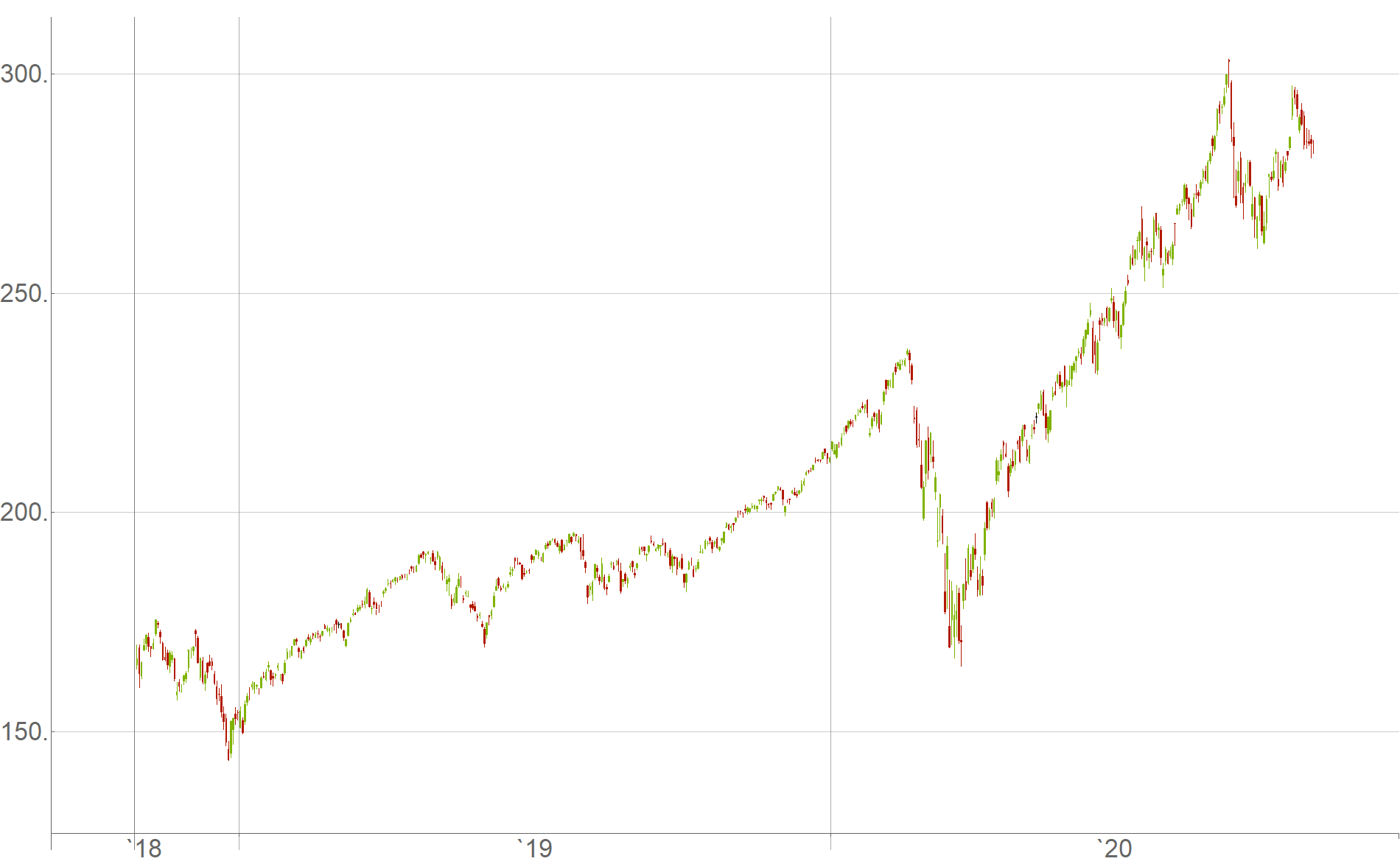
For raw data, we will use historical returns of the QQQ exchange-traded fund in the roughly two year period from October 26th, 2018 to October 23rd, 2020, as a randomly selected time span of interest:

For granularity of data we choose candlesticks $c$ containing open-, high-, low- and close-price values within $5$-second time intervals
\[c=(\text{open},\text{high},\text{low},\text{close}) ~.\]Each data point we consider shall start at a point in time $t$ and consist of a section of $50$ consecutive $5$-second candlesticks
\[p_t = \left (c_{t}, ~c_{t+1}, ~c_{t+2}, ~... ~, ~c_{t+49}\right ) ~,\]for a total time interval of $250$ seconds, or $4.166$ minutes.
How do we classify whether a given data point of $50$ candlesticks predicts future price action that is positive or negative? We define the classification as:
- Positive ($+1$): If the price goes up by a specified risk unit $r$ immediately after the $50$ candlestick interval, before falling by the same amount instead.
- Negative ($-1$): If the price goes down by the same specified risk unit $r$ immediately after the $50$ candlestick interval, before rising by the same amount instead.
To select a reasonable amount of expected volatility, we specify the risk unit $r$ to be the difference between the highest high and the lowest low among the $50$ candlesticks in the data point
\[r_t = \max_{\text{high}}(p_t)-\min_{\text{low}}(p_t) ~,\]and we measure whether future price action is rising or falling, using the mean value of the first future candlestick as the hypothetical buy- or sell-position entry point
\[\text{entry}_{t} = \frac{c_{t+50}[\text{open}]+c_{t+50}[\text{high}]+c_{t+50}[\text{low}]+c_{t+50}[\text{close}]}{4}.\]This means, if future price action reaches the point $\text{entry}_t+r_t$ before the point $\text{entry}_t-r_t$, it is classified as positive, and vice versa for negative. We think of this setup as risking $r_t$ to make $r_t$ while betting on the price to go up or to go down based on our analysis.
What do we do if the price does not go up or down by $r_t$ for a very long time? Since the market moves relatively continuously throughout the day and exhibits jumps overnight, we can agree to close all positions when the market closes for the day. In that case we classify the data point as positive if the price at market close is above $\text{entry}_t$, and as negative if it is below.
Given a sample of $50$ consecutive candlesticks, how do we transform this data to one dimensional histograms? We associate each data sample with four histograms based on the sequences of open-, high-, low- and close-price values respectively. In particular, in each case we first subtract the minimum from all the values in the respective sequences
\[\begin{align} h_{t,1}&=p_t[\text{open}] - \min(p_t[\text{open}])\\ h_{t,2}&=p_t[\text{high}] - \min(p_t[\text{high}])\\ h_{t,3}&=p_t[\text{low}] - \min(p_t[\text{low}])\\ h_{t,4}&=p_t[\text{close}] - \min(p_t[\text{close}]) \end{align}\](here a scalar $\min(p_t[ ~\cdot ~])$ is implied to be subtracted from each element of a vector $p_t[ ~\cdot ~]$). Subsequently, we normalize each histogram such that all $50$ weights sum up to one (overwriting $h_{t,i}$)
\[\begin{align} h_{t,i}&=\frac{h_{t,i}}{\sum h_{t,i}} ~ ~ ~, ~ ~ ~ i=1,2,3,4. \end{align}\]This allows us to calculate the earth mover’s distance between two data points. Here we define the total distance between two samples $p_{t_a}$ and $p_{t_b}$ as the sum of the corresponding four histogram distances
\[\label{Ddef}D(p_{t_a},p_{t_b}) \equiv \sum_{i=1}^4 \text{EMD}(h_{t_a,i},h_{t_b,i}) ~.\tag{1}\]Note that the histogram normalization discards information concerning the amount of market volatility encoded in the candlesticks. However, since the risk unit $r_t$ is defined proportionally to this volatility we do not actually neglect it. Rather, this corresponds to the first order approximate assumption that a given candlestick pattern, if it exists, is active on various volatility scales.
Finally, how many sections of $50$ consecutive candlestick intervals do we sample from the raw data? The main bottleneck here is the amount of RAM memory that is available to store and work with the data. (Here we are interested in a quick and dirty proof of concept investigation, so we want everything to fit in RAM, without having to deal with the additional complications of hard drive data storage and dynamic access.) If we work with $N$ data samples, to investigate their clustering properties we will require the calculation of a symmetric distance matrix with $\frac{(N-1)N}{2}$ independent elements. Each pairwise distance value is stored as a double precision floating point number occupying $8$ bytes of memory. My laptop has $32$ GB of RAM, which means that I can allot roughly $15$ GB of RAM to the distance matrix while keeping enough RAM space available for other needs. This corresponds to the number of data points $N\approx 60000$. Given that this number of samples is fairly modest, how can we maximize the amount of useful information contained in the data points we select?
Empirically, the time interval between market open at 9:30 am and noon EST features more engagement by market participants, while the rest of the day is less volatile. Therefore, we sample data points only from this more active time interval each day. If we collect several $50$ candlestick sections which overlap too much, we will likely end up with a lot of data points that are very similar due to time proximity. Therefore, we choose to sample $50$ candlestick sections from the raw data with a stride of $15$ candlesticks, corresponding to a relative shift by $1.25$ minutes. Over the interval of days and time of day mentioned above, this amounts to the desired number of samples ($N=60167$ to be precise).
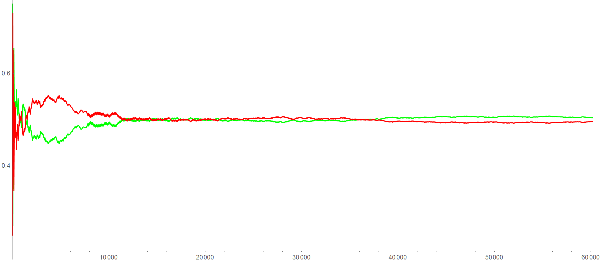
Cumulatively, the percentage of positive samples (green) and negative samples (red) in this data set looks as follows

which verifies that $60167$ samples are enough for the data to asymptote to a balanced
\[\label{balance}50.39\% ~\text{ Positive } ~ ~ ~, ~ ~ ~ 49.61\% ~\text{ Negative }\tag{2}\]distribution of examples. Considering that the QQQ ETF had a positive drift during the two year time period in question, we do expect the observed slight asymmetry.
In the stock market, we are interested in using past price data to make estimates and predictions of how future price data will evolve. For that reason, we do not shuffle the samples in our data set. Instead we use the first $50000$ samples as our training set in which we search for clusters of histogram patterns. We set the remaining future $10167$ data samples aside, to be used as a test set once predictive cluster candidates have been found in the training set.
Searching for Clusters of Patterns in the Training Set
So far, we have converted raw price data into a data set of labeled samples. A pair of samples can be compared via the distance metric $\eqref{Ddef}$, but how do we go about determining whether subsets of samples form distinguishable clusters?
Typical cluster separation methods like K-means, or K-medoids do not seem to be well suited here, since they implicitly assume that all data points should be divided into clearly separable clusters. These algorithms also assume that the number $K$ of clusters present in the data is known, though there are ways to estimate $K$ without knowing it beforehand. In our case we are dealing with a situation in which most data points are random and should not be considered as part of any meaningful cluster. However, we might expect that smaller subsets of points form relatively dense pockets with certain degree of imbalance towards positive or negative samples. From that perspective, hierarchical clustering seems most appropriate.
We start by computing the distance $\eqref{Ddef}$ for each unordered pair of samples from the training set of $n=50000$ data points. This produces $\frac{n(n-1)}{2}=1249975000$ different distances which we sort in increasing order. Making use of a disjoint-set data structure we then proceed to iteratively merge samples of least distance into clusters, while checking the current number and size of existing clusters every $100$ iterations. During this process several clusters emerge that grow at different rates. Eventually all clusters merge into a single cluster at which point the iterative procedure terminates.
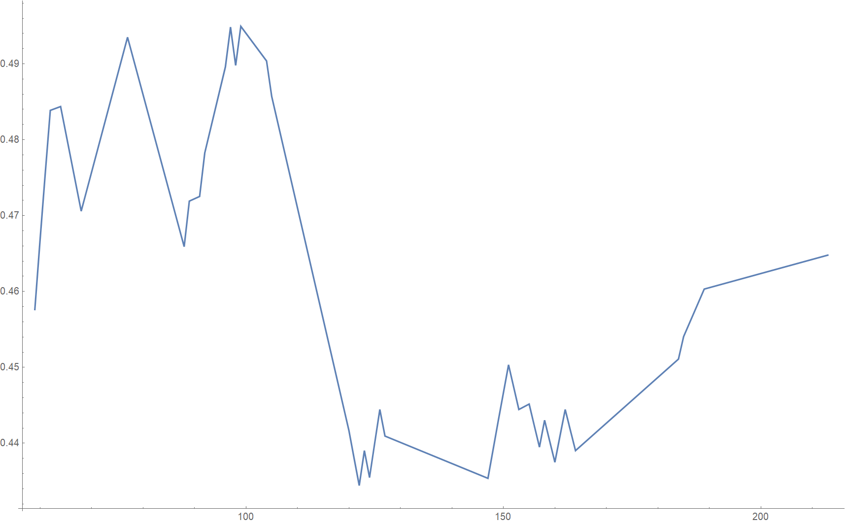
While keeping track of clusters in the intermediate steps, we concentrate only on clusters containing at least $0.1\%$ of the total number of training samples, to ensure that the number of included data points is sufficiently large in order to make a statistically meaningful observation regarding a potential imbalance of positive or negative samples. The fraction of positive samples against the growing overall number of samples in a cluster may evolve as in the following actually measured example (see cluster $f$ below):

In the above plot we can see that the biggest imbalance of only $\sim 44\%$ positive samples (and therefore $\sim 56\%$ negative samples) occurs when this cluster has grown to roughly $150$ samples in size. However, for better statistics, in this case it makes sense to consider the largest version of this cluster when it has grown to over $200$ samples, since the imbalance still largely persists and shrinks only by two percentage points to $\sim 46\%$ positive samples. (The growth of this cluster terminates when it merges with an even larger cluster and therefore ceases its independent existence.)
We classify an imbalance of positive versus negative samples within a cluster as sufficiently meaningful if it deviates from the balanced state of the overall data $\eqref{balance}$ by at least $2\%$.
Among all the clusters that emerge during the merging procedure there happen to be exactly $14$ which match the above size and imbalance criteria. (In each case, for better statistics we select the biggest version of a cluster that still features the required minimum degree of imbalance.):
\[\label{gotC}\begin{array}{|c|c|c|} \text{Cluster} & \text{Cluster size} & \text{$\%$ of positive samples} \\ \hline a & 113 & 44.2478 \\ b & 134 & 55.2239 \\ c & 112 & 46.4286 \\ d & 60 & 56.6667 \\ e & 56 & 55.3571 \\ f & 213 & 46.4789 \\ g & 402 & 45.0249 \\ h & 59 & 62.7119 \\ i & 152 & 56.5789 \\ j & 51 & 60.7843 \\ k & 235 & 48.5106 \\ l & 98 & 56.1224 \\ m & 60 & 46.6667 \\ n & 53 & 58.4906 \\ \end{array}\tag{3}\]Out of the $14$ clusters in $\eqref{gotC}$, $8$ feature an excess of positive samples, while $6$ feature an excess of negative samples. All of the imbalanced clusters together contain $1798$ samples in total, which is $\sim 3.6\%$ of the training set and would be consistent with our expectation that predictable fat tail events comprise only a small subset of the overall data. (Of course, at this point in the analysis we cannot tell whether we are dealing with actually predictive patterns or statistical flukes by just looking at the training set). We expect the imbalances featured in clusters $f, ~g$ and $k$ to be statistically more reliable due to the larger number of samples in these clusters.
Measuring the Predictiveness of Determined Clusters on the Test Set
Now that we have found a number of clusters with promising sample imbalances in the training set, how do we determine if previously unseen samples in the test set belong to any of these clusters? To facilitate that, we determine the medoid sample in each of the clusters $\eqref{gotC}$, and measure the mean distance $\eqref{Ddef}$ from the medoid sample to all other samples in the cluster. This allows us to classify a sample from the test set as belonging to a respective cluster if its distance $\eqref{Ddef}$ to the medoid sample of that cluster is smaller than the aforementioned mean distance.
Making use of this criterion, the test set assigns the following sample distributions to the $14$ clusters
\[\label{testC}\begin{array}{|c|c|c|} \text{Cluster} & \text{Cluster size} & \text{$\%$ of positive samples} \\ \hline a & 111 & \color{red}{50.4505} \\ b & 30 & \color{red}{43.3333} \\ c & 28 & 42.8571 \\ d & 29 & \color{red}{37.931} \\ e & 18 & \color{red}{38.8889} \\ f & 56 & 46.4286 \\ g & 157 & 47.7707 \\ h & 19 & 68.4211 \\ i & 40 & 50. \\ j & 15 & 60. \\ k & 65 & 47.6923 \\ l & 24 & 79.1667 \\ m & 16 & 37.5 \\ n & 19 & \color{red}{42.1053} \\ \end{array}\tag{4}\]We have highlighted in red the imbalances that turned out opposite to the expected imbalances from the training set. Apart from cluster $a$, the opposite imbalances occur for clusters with especially low number of samples in training as well as test set, which we would not consider statistically significant. However, we expect clusters with larger number of samples such as $f, ~g$ or $k$ to be more statistically significant and therefore more predictive; Indeed we observe that they successfully feature roughly the expected imbalances on the test set as well.
Conclusion
The test set confirmed imbalances in some of the clusters as potentially predictive, while showing other clusters as unreliable $\eqref{testC}$. Can we measure how well our cluster model performs overall? To evaluate the performance of a model it is convenient to come up with a single number value function that we would like to see maximized relative to competing models in order to better understand the performance of our model.
Consider the following strategy: To each cluster with sufficient imbalance on the training set $\eqref{gotC}$ we assign a buy action if it contains a larger number of positive samples, and a sell action if it contains a larger number of negative samples. Then we proceed to the test set and count the number of normalized risk units $r$ we accumulate after performing the respective buy and sell actions on each sample assigned to the specific clusters. Summing up all the gains and subtracting all the losses in case of $\eqref{testC}$, we are left with a net positive $+27 r$ return after taking a total of $627r$ of risk. This corresponds to $4.31\%$ return on risk.
To compare the above result with a simpler benchmark, we could recall that the full data set itself features a small imbalance $\eqref{balance}$ thanks to the upward drift in the QQQ ETF returns. Treating the full data set as a single cluster, and performing a buy action on every single sample since the cluster is imbalanced in favor of positive samples, we obtain a much smaller $0.78\%$ return on risk when trying to benefit just from the upward market drift. Additionally, this return is achieved after performing a much larger amount of buy actions ($60167$ total) which may be a disadvantage due to neglected transaction costs. (Of course, a better strategy to benefit from market drift is a simple buy and hold, but the point here is to keep the rules of the strategy consistent to determine the utility of finding smaller predictive clusters). Additionally, the buy only strategy produces excessively one-sided risk, while the smaller predictive cluster model diversifies the risk better between buy and sell actions.
Overall, our predictive cluster model seems somewhat promising based on the data considered so far. However, the biggest issue is that the number of samples considered is much too small. To make the statistics more reliable it would be interesting to perform the same analysis with data sets several orders of magnitude larger. Additionally, one might want to sample the data from different historical time intervals, to test whether the predictiveness of imbalanced clusters found in the training set depends on the particular market conditions prevailing during the selected interval. Finally, we could ask whether such predictive clusters exist in price data of other assets as well.